Forums
/ Edited: 17/01/2024 /
Topic for everything related to Qtractor theming.
Themes availables: https://sourceforge.net/projects/visualthemes-qtractor/
(Attach two starting approaches for two visual themes and a proposal for functionalities.)
/ Edited: 11/07/2025 /
Tecnico 4 | Final Version
File attachments
re. Theming in Qtractor
hi, are these just mockups or does it have some code already?
seeya
re. Theming in Qtractor
The form is simply an example.
Theme designs do have some code already created. I am using as a trick to insert the css directly into the "qt configuration" tool that MX Linux comes with.
I've been browsing around with Qt5designer for a couple of days. And that has allowed me to understand how to get to the Qtractor classes with CSS.
As you can see in example 2, ThemePunk, the menu is horrible, the dark text is barely readable. When you go to Qtractor's configuration menus, the visual horror is much greater.
This is due to the limitations of only having [ColorThemes].
If we could incorporate custom CSS and icons, we could create amazing themes.
For me design is important.
For example, with the first topic I propose, a sound engineer would feel at home, with a modern and legible environment.
With the second, an electronic music musician would find an exciting and suggestive environment for his creativity.
Not to distract from this
Not to distract from this thread but wanted to add I've been happier with the theming situation ever since installing the Kvantum theming engine on my system. It's a bit of a rabbit hole to discuss at length but the end result is now my Qtractor looks like everything else running on my system. Of course, I still have the icons which makes me really appreciate your idea to potentially break those out into packs.
I pause the theming proposal
Windowsrefund, Your comment has made me see that I have not considered all the implications of the change I proposed.
What would happen then to those who trust a solution like Kvantum?
I'm not going to abandon the project, I'm passionate about designing, and getting seriously into UI is something I've wanted for a long time.
If in the end the community and especially Rui don't see the point, at least I will be able to enjoy my work :).
But I will redo the proposal when it is mature and has not only some operational design, but also a way to implement it.
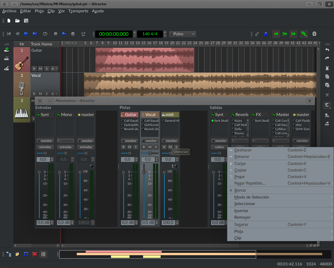
Qss doubts
Hi Rui
I have started creating themes for Qtractor.
I try to access specific elements of the buttons via qss.
Something like that:
QWidget[objetName="editCutAction"]{
qproperty-icon: url("urlExample.png");
qproperty-iconSize: 14px;
}
But not work. How can I do it?
This may not be the place to consult it, it is not important, nor is there a rush, but...
If you can help me I will appreciate it.
re. Qss doubts
hi, simply IDK :S
I confess never used Qt style-sheets in life ; OTOH: how are you setting the qss? from command line or via QApplication/QWidget::setStyleSheet() in code? where's and how the icon url (.png) is located and resolved ? had you any success with other attributes ?
byee
Thanks
I'm doing tests in Qt Designer.
I would change all the app icons to: Example.png.
QWidget {
qproperty-icon: url(:/images/Example.png);
}
But not a concrete one.
QAction is not a widget, .maybe that's why.
I will continue investigating, thank you.
Not is posible
I had planned to develop a theme system for Qtractor, where the icon packs were managed by CSS, and thus allow total customization of the application.
For example, larger buttons without separation for transport, the time box integrated in proportions, etc.
But it is not possible. Only widgets are fully accessible by CSS (qss).
Return to topic
I return to the topic of theming for Qtractor.
After some time testing I think I am clear about the necessary functionality.
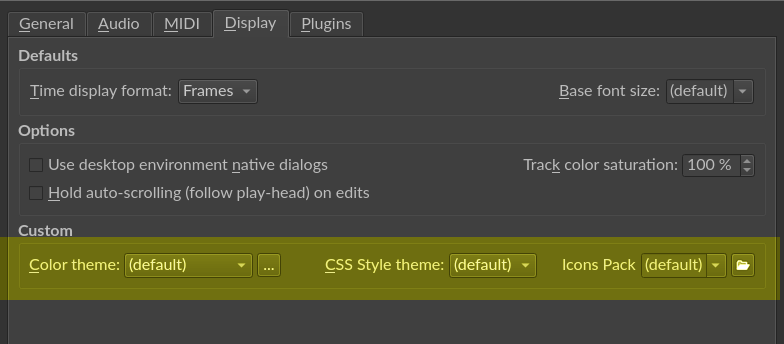
Currently it is possible to apply styles in Qtractor with the "qt5ct" application, but I think it would be nice if it could be done directly from Qtractor without installing anything else.
_INTRODUCTION
The color scheme, as recognized in Qt's own documentation, falls very short.
Different parts of an application may require different schemas.
Qt Styles rule color schemes, so your Color Scheme settings can be unpredictable in practice.
Not everything is color, sometimes it is thicknesses or sizes that we are interested in modifying.
Fortunately Qt has implemented QSS, based on CSS logic.
The order of priority in styles is like this:
Color Scheme < StyloQt < QSS Style
This allows us to greatly customize the appearance of the application.
_Examples that I have made.
Personally, the raised strip that the Qt fusion style puts on the toolBar bothers me a lot.
For dark themes I have a hard time finding a good combination for the time bar that doesn't conflict with other parts of the app.
I took the opportunity to eliminate that ugly icon for the handle and replace it with a discreet symbolic bar.
Etc etc.
This would be the QSS code.
/* ------------------------------------------ */
QToolBar{
border-top: 1px solid rgb(250, 250, 250, 30);
border-bottom: 1px solid rgba(0, 0 ,0, 30);
background: qlineargradient(x1:0, y1:0, x2:0, y2:1,
stop:0 rgba(0, 0 ,0, 15),
stop:1 rgb(250, 250, 250, 15));
}
QToolBar::handle {
margin: 2px;
background: rgb(125, 125, 125, 100);
}
qtractorTrackTime {
margin-top: 1px;
border: 1px solid #555555;
background: #333333;
}
/* ------------------------------------------ */
Another example, stand out elements such as the clock:
IMPLEMENTATION
The file can simply be read from outside by storing the absolute path in the options file.
You could also make it, like the Color Theme option, incorporate a small editor with import, export, etc... but it is really dispensable and I suppose it is complex to implement.
Here they explain the basic way to import QSS.
https://stackoverflow.com/questions/4448236/how-could-qt-apply-style-fr…
re. Return to topic
hey!
you can load a style-sheet file (*.qss) anytime from the command line, just like that:
no need to bother and code any new or additional widgets to the options dialog :)
hyu.
cheers
That's great, thank you
That's great, thank you
DAWicons
Don't let Rui know, but I have redesigned some of the Qtractor icons.
My reasons:
_1
That the typical controls of a "Tape Recorder" are clearly identified, emulating buttons from the analog world.
_2
Leave color coded blue only those that are closely related to "ranges".
In green those related to displacement.
(By the way, if record is red and playback is green, shouldn't the head be green when playing and red when recording?).
_3
Improve symbolic legibility in:
- Countdown
- Master Modes
_4
The track icons were confused with the clip icons as both elements were raised.
By leaving the track without relief and the time slots, it is more understandable.
_5
The rest? Honestly, I love them. They have a cool retro style, and are super readable.
That two styles coexist (symbolic for transport, retro not transport) manages to differentiate the transport controls from the "operational/modifying" functionalities.
The file contains the multipage svg (Inkscape 1.3 or higher) and the icons in .png.
I share them in case anyone else considers it useful to include them in their compilations, modify them, and/or give them other uses.
Well well well.... hope Rui
Well well well.... hope Rui doens't ban you from this lovely Qtractor forum...
With these modified icons, to my ears Qtractor already sounds less digital and a very lot more analog :-)
Would be nice though if the tiny magnifier icons inside Qtractor could be modified to less smaller better readable ones.
Don't know if thats possible with this theming project ?
re. Well
In principle I think it is possible, but it is not recommended.
Those icons are integrated into the scroll bars.
Making scroll bars bigger is stealing precious space from the rest of the application.
Qtractor should be able to include mouse events in keyboard shortcuts.
In my case I would configure it as:
[Ctrl]+CenterMouseScrol= Horizontal Zoom
[Ctrl]+[Shift]CenterMouseScrol= Vertical Zoom
[Ctrl]+[Alt]CenterMouseScrol= Full Zoom
This would also allow zoom's behavior to be homogeneous in the sequencer and the MIDI editor.
__
Other behavior I would find intuitive related to zoom:
- In the sequencer zoom in and out track [Ctrl]+CenterMouseScrol
(It would work to add to the current [Ctrl]+[+/-] without having to release your hands from the mouse)
- In the midi editor [Ctrl]+CenterMouseScrol on the keyboard = [Ctrl]+CenterMouseScrol= Vertical zoom
Both the track area and the piano have a vertical layout and only vertical zoom makes sense, so simply [Ctrl] and not [Ctrl]+[Shift].
I take back what I said.
I take back what I said.
Now I have understood the logic with the Vertical, Horizontal and All shortcut options.
This, together with the buttons, gives full functionality to the zoom.
It's just learning how to work like this.
Whoever needs larger buttons for high monitor resolutions can do so through QSS.
In the midi editor it works perfectly. On the sequencer, however, the "reset zoom" button is out of square (I don't know why). In any case, it is functional.
Enlarge the zoom icons
Create a text file in "any place" and call it, for example, CustomQtractor.qss
Inside copy this code and save it:
QScrollBar:horizontal {

height: 20px;

}

QScrollBar:vertical {

width:  20px;

}

qtractorScrollView QWidget {

min-height: 20px;

min-width:  20px;

}
As you can see, you can modify the width and height as you prefer.
Edit the Qtractor launcher, or put this command in the console:
qtractor -stylesheet "any place"/CustomQtractor.qss
Hi there,
Hi there,
Thank you, I did use your CustomQtractor.qss code here above and indeed, the magnifier icons are bigger.
But depending on the used style-theme the alignment ( of the zoom reset icon and scrollbars ) isn't always right.
It's nice to see and learn from your posts to see what's possible and have some inspiration.
If it was up to me, the magnifier icons would have been replaced with a + and - icons, but it's not a show stopper ( like Rui would say ).
I just did go from MX21 to MX-Linux 23.1 KDE Plasma, now having 'trouble' Qtractor dont have the nice greyblue look anymore when selecting the Wonton Soup Color theme.
Still investigating why, but definitively hope to succeed in loading Qtractor with the 'intended' nice greyblue look like on Qtractor's website.
This one : Wonton Soup
Take care.
The answer to all these problems
The answer to all these problems is to compile the source code instead of using installables.
I tried it recently and it's incredible.
Everything works (except the translation, although I suppose it can be fixed), and you can customize 100%.
Once compiled it is not even necessary to install it.
(next year I intend to do a How to)
__
The shifting of the icons is due to how the bars are implemented in the code. I think I have found the part of code that generates the issue, but I still don't know how to fix it.
I recommend that you modify the code I gave you to 16px or 18px.
__
The issue of not showing the "Wonton Soup" theme is due to the kde/gtk integration. I almost had the problem fixed without knowing how, but the compiled version fully respects the color schemes. By the way, put it in "Fusion" style.
__
As for icon themes, compiling also makes it possible, you just have to overwrite the icons with the ones you want before compiling.
I'm learning to touch the source code.
I have achieved a more homogeneous Midi Editor interface with that of the sequencer.
Time an Beats together, Panic and Follow Playhead together. Own icons etc.
I will share the code soon.
In the screenshot the icons are zoomed to 16px.
my fault.. ( wrong repo )
Cause of above, was me added the wrong repo to debian 12.4 based mxlinux 23.1.
After adding ( deb https://ppa.launchpadcontent.net/rncbc/apps-jammy/ubuntu jammy main ) repo to /etc/apt/sources.list.d/mx.list and adding the key via terminal :
sudo gpg --keyserver keyserver.ubuntu.com --recv-keys 74407499CD30F338
sudo gpg -a --export 74407499CD30F338 | sudo apt-key add -
sudo apt-get update
.. I did find the latest Qtractor in MX Package Installer.
New installed Qtracktor 9.37.8, Qt 6.4.2, Color theme Wonton Soup / Style theme Fusion running and looking great on a fresh MX23.1 KDE.
Maybe for someone else this information is helpfull.
Link forum
Thanks to Rui for adequate help support !!
New QSS Acceptable size and aesthetics
QScrollBar:horizontal {
height: 18px;
}
QScrollBar:vertical {
width: 18px;
}
qtractorScrollView QToolButton {
min-height: 18px;
min-width: 18px;
max-height: 18px;
max-width: 18px;
border: none;
}
re. DAWicons
in time for the season, it's going to look a lot like a x-mas tree!
XD
ps. before getting too excited about, nope, it's not going to happen, at least from this year santa's delivery ;)
re. DAWicons
"in time for the season, it's going to look a lot like a x-mas tree!"
It's funny because it's true XD
"ps. before getting too excited about, nope, it's not going to happen, at least from this year santa's delivery ;)"
I never intended for them to be officially included.
But if you see sense in it in the future, it would be an honor for me.
In that case they would be open to modifications and suggestions from the community and from you, who will always have the last word.
My first suggestions with some code
I have tried to make the midi editor and the sequencer more homogeneous.
The changes are:
__MIDI EDITOR
Attached new icon, qtractorMidiEditorForm (.ui .cpp), qtractor.qrc already functional.
_1
A new icon has been created for Clip Properties, differentiating it from editing.
_2
Track Properties share symbology (screwdriver not pencil "edit").
_3
Previously are used a clip type icon, when the recording activation affects the track and not the clip. Track symbology has been used consistently now.
_4 and 5
Arrangement equivalent to the sequencer.
Thanks to this I have verified that a new option is necessary in the sequencer.
__MIDI SEQUENCER
Attached qtractorMainForm.ui including the icon, but no functionality.
The "Clip Midi" properties should also be available from there, where they also make more sense to access. For example, to millimetrically trim the duration of a midi clip.
I leave to your judgment
re. My first suggestions with some code: new branch [G3N-es-x]
hi, congratulations
all your new code and icons are now in a brand new git branch: G3N-es-x
@G3N-es: in the future, please refer to this branch and only, for pull-requests (PRs) you may come about and share; the way of attachments is not the best nor convenient to this regard; also, and before you get too excited :) this doesn't mean whatsoever that it's getting my full approval, at least not as of yet, but simply to make it easier to share your work to some other victims^H^H^H^H^H^H^H users. ;)
hth.
cheers
re.
My knowledge of git is below basic,
but it's true, it's the way to share code.
It's time to study :-)
It will take me some time.
So cool to see the
So cool to see the collaboration happening here. Free Software and all its freedom on full display. Absolutely fantastic.
G3N-es, you mention you're getting familiar with git so figured I'd mention it might make more sense for you to maintain your own forked repo rather than simply work from a branch. I say that because you may find yourself wanting to work on one or more feature branches simultaneously as opposed to working from a single branch. In my experience, the easiest way to facilitate that clean separation it to work from a fork where you'd submit pull requests back upstream as each feature branch is developed. Of course, you'd also want to keep your fork's master branch up to date as well as upstream would be expected to change. There's plenty of information out there that goes into greater detail on this pretty standard work flow.
First theme available
Tecnico V.1
Recommended Qt Style: Fusion
Features
Installation
Decompress Tecnico_QtractorTheme.V1.zip to a path of your choice.
Theme color: Tecnico.conf.
Import into Qtractor from:
Qtractor > View > Options > Display | Custom | Theme Color > ...Import
QSS Style: Tecnico.qss
Edit your application launcher leaving it as follows:
You can also copy and paste the command into your console to preview the result.
Hi,
Hi,
Great stuff. The fonts are much more readable and I really like the new transport buttons and mixer sliders.
I do have a few questions though....
My tracks are still being rendered using the previously established colors (This session was created prior to importing and using the theme).
The blue used to highlight the menu selection doesn't seem to "fit".... kinda gives it a very "Microsoft Windows XP" feel? Maybe using one of the already used greys would work better?
The icons in the Options toolbar haven't taken on the new visual characteristics of those in the Transport buttons. Are there plans to get to a place where all icons characteristics and behaviors match?
The "Session Loop State" notice in the bottom right hand corner is still impossible to read given the white font against the bright green background. I know there's a "Session XRUN State" notification area to the right of it which suffers from the same problem;. although the background color is a bright yellow. Are there any plans to address these areas?
re. hi
_1
I do not understand what you mean. The track colors are configurable by the user.
_2
You are absolutely right hahaha. It will be included for the next version, I don't know how long it will take. Meanwhile you can set the color you want from Qtractor Options Colortheme by modifying the Highlight color.
_3
The idea of the theme is to remember the analogue, a tape recorder, a little for nostalgia, a little for functionality.
For example, a Tascam 424 MKII portastudio did all the work only with the mixer buttons and slider.
By nostalgia: in my case, remembering the tape recorders of the last century, from those included in radio cassettes, to an open-count recorder as a gift from my grandfather. In them I made my first attempts at recording.
By functionality: Visually separate the transport and time visualization part (basic and common in analog and digital), from those of a digital workflow (head tracking...), and in turn from common tools in any program (editing, file management, etc.).
Someone who has never picked up a computer comes and says, well, here's my play button and record of a lifetime, I can start and ignore everything else.
Or a sound technician comes and thinks, I like this, buttons shaped like buttons. Technicians press buttons, not icons. Because above all I am a technician, not a computer scientist. (emotional reasons?)
Maybe for other themes it makes sense to hogenize all the buttons. Not for this one.
Aha... I didn't expect that
Aha... I didn't expect that since we're talking about a "theme" which typically sets colors (among other things). If we're setting it manually, we'd need to know the colors to use in order to match your screenshot.
After trying a few things, I ended up settling on #555555 which I now set for Highlight, Link, and LinkVisited. Looks and feels pretty good :)
While I get and applaud the inspiration (cool background story also), I'd point out you wouldn't "lose" what it adds by striving for uniform buttons. At the end of the day, it's still a single piece of software and as such, it feels a bit rushed to accept an end result where group A buttons are seen as "cool" and "themeish" while group B buttons are seen as "quirky" or "not as cool". The end result in that kind of scenario is something that just looks and feels half completed.
Add new comment