Dear Rui, I am very thankful for your software. Yet I do not like the white icons. Is it okay for you if on my website I provide your software compiled with the old icons?
by all means you're free to revert the old icons if that pleases you better.
for the sake of mind, here goes the differences with that Procol Harum effect ;)
before (old aka. dammit win95 style icons):
after (new homebrew whiter shade of pale style icons):
Is that a really shocking move ? Let me tell that it's all intended to make all those standard, old-fashioned, dumb routine icons to be a little less prominent (is that even a High-German word? :)). Let's also remember that those older icons style are eh... more than whole two decades old?
Anyway, I am not really ditching your opinion. In fact, the reason why it stayed like that so many years (a dozen) has been quite a stance for some (focusing on what really is the core mission: an audio/MIDI sequencer) but also a curse from others (say "this surely looks as ugly as old fashion an UI can go--it sure cannot possibly do whatever it claims to standards while on this new millennium") yeah, you know the thrill ;) (here we use to say:- One cannot ever please both Greeks and Trojans, ever.)
Leaving all the rest behind, if you may of course chose to do the way you please, you probably like the new Whiter Shade of Pale Mixer icon, don't you? :)
"those older icons style are eh... more than whole two decades old"
So they look extremely stylish and fresh to my eyes, I am more than five decades old ;-)
Picture a) shows clearly how qtractor can bring colour into a poor musician's life!
should i tell that is not a surprise we're contemplating the very same five decades past? :)
ok. maybe you want to spice up the colors and whatnot on those new icons: if you really into that mood, you can grab the whole draft set from right here: qtractor-iconx-1.zip and there you may find all them in the glorious scaleable SVG format (and in pristine PNG too) so you can fire up inkskape (or whatever vector drawing s/w you like) and tear them all apart at you please, specially re. some coloring perhaps?
cheers
ps. you din't say a thing about that new Mixer icon though :(
Five decades really is a long time - how are your teeth and your spine ;-)
You've read my thoughts, I really started to add some individual icons. The more colourful the more I like them. Thanks, I downloaded your icon-package.
"ps. you din't say a thing about that new Mixer icon though :("
Your white mixer icon is extraordinarily egregious. Very extremely vaguely it reminds me of the final scene in the movie "Il buono, il brutto, il cattivo". Three white crosses in different height marked the place of a treasure on a graveyard. After the final gun-fight, the hero rode into the sunset, whispering "Will you communicate with me ever again?"
Besides talking nonsense , I thank you so much for your software - I really have a lot of fun working with it!
Cheers, Michael
Hi Rui,
I slept over this topic and now seriously:
In deep respect of your work I won't change the downloadable versions of your "babies". But I will give your icon set a slightly touch of colour and present it to you in some time. Maybe you'll like a design like this one: https://servimg.com/view/12842335/64
i like the idea but why not some pale colors (as in not being plain primary)? and no, the "colored" mixer icon is definitely not to my taste :)
there follows my own (critical) opinions:
1. fileOpen: yellow is good, but probably better with some darker shade on the slanted face ?
2. fileSave: green is not good--maybe the same sort of shade as above?
3. editUndo/editRedo(?): plain red is no good either here--maybe plain blue with bevel shadow filtering?
4. editCut/editCopy/editPaste: why not plain as it was, whiter-shade-of-pale style? also, I'm planning to remake those but still on the bleached whiteness though :)
5. viewMixer: nope, just plain nope. sorry. (i love the whiter that's for granted:))
6. viewPreview (aka. speaker icon): green is good and again a bevel shadow would be nicer though.
The last weeks I tried to create a "consistent" set of icons using tango icon set, icons from open icon, ... and didn't like any of my creations.
My deep respect of your great work grew again because I learned how much labour it is to make decisions concerning layout and design!
If I succeed I'll show but until then I'll behave humble and thankful ;-)
Hi!!!Glad to be in contact!!
Yes,they look liquid!!!!
There is a shadowy look around the waveform that I dont like much, like a color variation
and it wont go away unless you choose a black foreground color (maybe a white too)
Have worked a lot with Cubase,FL studio,etc!!(my first sequencer was Cubase-Atari-1992!!!)
Hope I am not causing any trouble!!!!
well, audio clip wave-forms are always drawn and composed of 1) the peak-to-peak envelope (the outer and lighter in color) and 2) the RMS power envelope (the inner darker colored, always symmetrical to the 0dc level axis)--all these are there since day one on qtractor and that makes for a dozen years ago already, you're the first to complain about that :)
Hi again!!!
Ok that makes very good sense,although I would prefer a different (same as the background?) color line separating the (same color) two
envelopes,I think it would look nice!!
Dont misunderstand me ,I can see the core mission you mentioned above in this topic but I think looks is importand and appealing too!!
Thanks and bye!!!
hi, some re-design have been brought on the week-end to some icons but mostly keeping with the Procol Harum effect style ;)
you can find the new set in here qtractor-iconx-1a.zip
re. A Whiter Shade Of Pale
by all means you're free to revert the old icons if that pleases you better.
for the sake of mind, here goes the differences with that Procol Harum effect ;)
Is that a really shocking move ? Let me tell that it's all intended to make all those standard, old-fashioned, dumb routine icons to be a little less prominent (is that even a High-German word? :)). Let's also remember that those older icons style are eh... more than whole two decades old?
Anyway, I am not really ditching your opinion. In fact, the reason why it stayed like that so many years (a dozen) has been quite a stance for some (focusing on what really is the core mission: an audio/MIDI sequencer) but also a curse from others (say "this surely looks as ugly as old fashion an UI can go--it sure cannot possibly do whatever it claims to standards while on this new millennium") yeah, you know the thrill ;) (here we use to say:- One cannot ever please both Greeks and Trojans, ever.)
Leaving all the rest behind, if you may of course chose to do the way you please, you probably like the new Whiter Shade of Pale Mixer icon, don't you? :)
cheers
re. A Whiter Shade Of Pale
Dear Rui - the Trojan!
"those older icons style are eh... more than whole two decades old"
So they look extremely stylish and fresh to my eyes, I am more than five decades old ;-)
Picture a) shows clearly how qtractor can bring colour into a poor musician's life!
Greetings, Michael - the Greek!
re. A Whiter Shade Of Pale
should i tell that is not a surprise we're contemplating the very same five decades past? :)
ok. maybe you want to spice up the colors and whatnot on those new icons: if you really into that mood, you can grab the whole draft set from right here: qtractor-iconx-1.zip and there you may find all them in the glorious scaleable SVG format (and in pristine PNG too) so you can fire up inkskape (or whatever vector drawing s/w you like) and tear them all apart at you please, specially re. some coloring perhaps?
cheers
ps. you din't say a thing about that new Mixer icon though :(
re. A Whiter Shade Of Pale
Dear Rui!
Five decades really is a long time - how are your teeth and your spine ;-)
You've read my thoughts, I really started to add some individual icons. The more colourful the more I like them. Thanks, I downloaded your icon-package.
"ps. you din't say a thing about that new Mixer icon though :("
Your white mixer icon is extraordinarily egregious. Very extremely vaguely it reminds me of the final scene in the movie "Il buono, il brutto, il cattivo". Three white crosses in different height marked the place of a treasure on a graveyard. After the final gun-fight, the hero rode into the sunset, whispering "Will you communicate with me ever again?"
Besides talking nonsense , I thank you so much for your software - I really have a lot of fun working with it!
Cheers, Michael
re. A Whiter Shade Of Pale
Hi Rui,
I slept over this topic and now seriously:
In deep respect of your work I won't change the downloadable versions of your "babies". But I will give your icon set a slightly touch of colour and present it to you in some time. Maybe you'll like a design like this one: https://servimg.com/view/12842335/64
Thank you and sincerely yours, Michael
re. A Whiter Shade Of Pale
re. Maybe you'll like a design like this one: https://servimg.com/view/12842335/64
i like the idea but why not some pale colors (as in not being plain primary)? and no, the "colored" mixer icon is definitely not to my taste :)
there follows my own (critical) opinions:
1. fileOpen: yellow is good, but probably better with some darker shade on the slanted face ?
2. fileSave: green is not good--maybe the same sort of shade as above?
3. editUndo/editRedo(?): plain red is no good either here--maybe plain blue with bevel shadow filtering?
4. editCut/editCopy/editPaste: why not plain as it was, whiter-shade-of-pale style? also, I'm planning to remake those but still on the bleached whiteness though :)
5. viewMixer: nope, just plain nope. sorry. (i love the whiter that's for granted:))
6. viewPreview (aka. speaker icon): green is good and again a bevel shadow would be nicer though.
cheers and thanks
re. A Whiter Shade Of Pale
The last weeks I tried to create a "consistent" set of icons using tango icon set, icons from open icon, ... and didn't like any of my creations.
My deep respect of your great work grew again because I learned how much labour it is to make decisions concerning layout and design!
If I succeed I'll show but until then I'll behave humble and thankful ;-)
Cheers, Michael
qtractor looks
sorry if i am out of the topic but
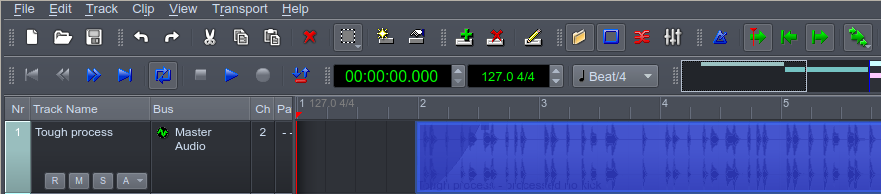
i would like better looking audio and midi clips
especially more solid audio waveforms!!!
Hi from Greece!!!
re. qtractor looks
especially more solid audio waveforms!!!
solid? what you mean? are they too dang liquid? :)
do you have some visual suggestion?
cheers
liquid!!!
Hi!!!Glad to be in contact!!
Yes,they look liquid!!!!
There is a shadowy look around the waveform that I dont like much, like a color variation
and it wont go away unless you choose a black foreground color (maybe a white too)
Have worked a lot with Cubase,FL studio,etc!!(my first sequencer was Cubase-Atari-1992!!!)
Hope I am not causing any trouble!!!!
re. liquid!!!
well, audio clip wave-forms are always drawn and composed of 1) the peak-to-peak envelope (the outer and lighter in color) and 2) the RMS power envelope (the inner darker colored, always symmetrical to the 0dc level axis)--all these are there since day one on qtractor and that makes for a dozen years ago already, you're the first to complain about that :)
byee
peak vs RMS
Hi again!!!
Ok that makes very good sense,although I would prefer a different (same as the background?) color line separating the (same color) two
envelopes,I think it would look nice!!
Dont misunderstand me ,I can see the core mission you mentioned above in this topic but I think looks is importand and appealing too!!
Thanks and bye!!!
re. Whiter Shale Of Pale II
hi, some re-design have been brought on the week-end to some icons but mostly keeping with the Procol Harum effect style ;)
you can find the new set in here qtractor-iconx-1a.zip
cheers
Add new comment