Main menu
You are here
Add new comment
DAWicons
Don't let Rui know, but I have redesigned some of the Qtractor icons.
![]()
My reasons:
_1
That the typical controls of a "Tape Recorder" are clearly identified, emulating buttons from the analog world.
_2
Leave color coded blue only those that are closely related to "ranges".
In green those related to displacement.
(By the way, if record is red and playback is green, shouldn't the head be green when playing and red when recording?).
_3
Improve symbolic legibility in:
- Countdown
- Master Modes
_4
The track icons were confused with the clip icons as both elements were raised.
By leaving the track without relief and the time slots, it is more understandable.
_5
The rest? Honestly, I love them. They have a cool retro style, and are super readable.
That two styles coexist (symbolic for transport, retro not transport) manages to differentiate the transport controls from the "operational/modifying" functionalities.
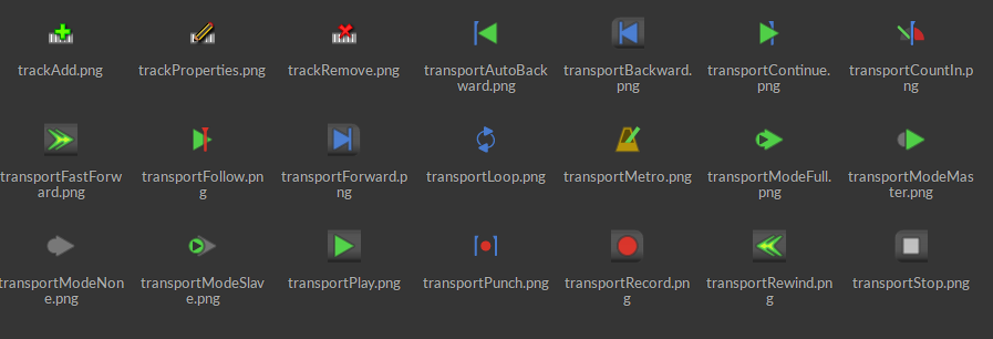
The file contains the multipage svg (Inkscape 1.3 or higher) and the icons in .png.
I share them in case anyone else considers it useful to include them in their compilations, modify them, and/or give them other uses.
Recent comments
3 days 22 hours ago
3 days 22 hours ago
6 days 21 hours ago
1 week 5 days ago
1 week 6 days ago
2 weeks 1 day ago
2 weeks 1 day ago
2 weeks 1 day ago
2 weeks 1 day ago
2 weeks 2 days ago