Main menu
You are here
Add new comment
Hi,
Hi,
Great stuff. The fonts are much more readable and I really like the new transport buttons and mixer sliders.
I do have a few questions though....
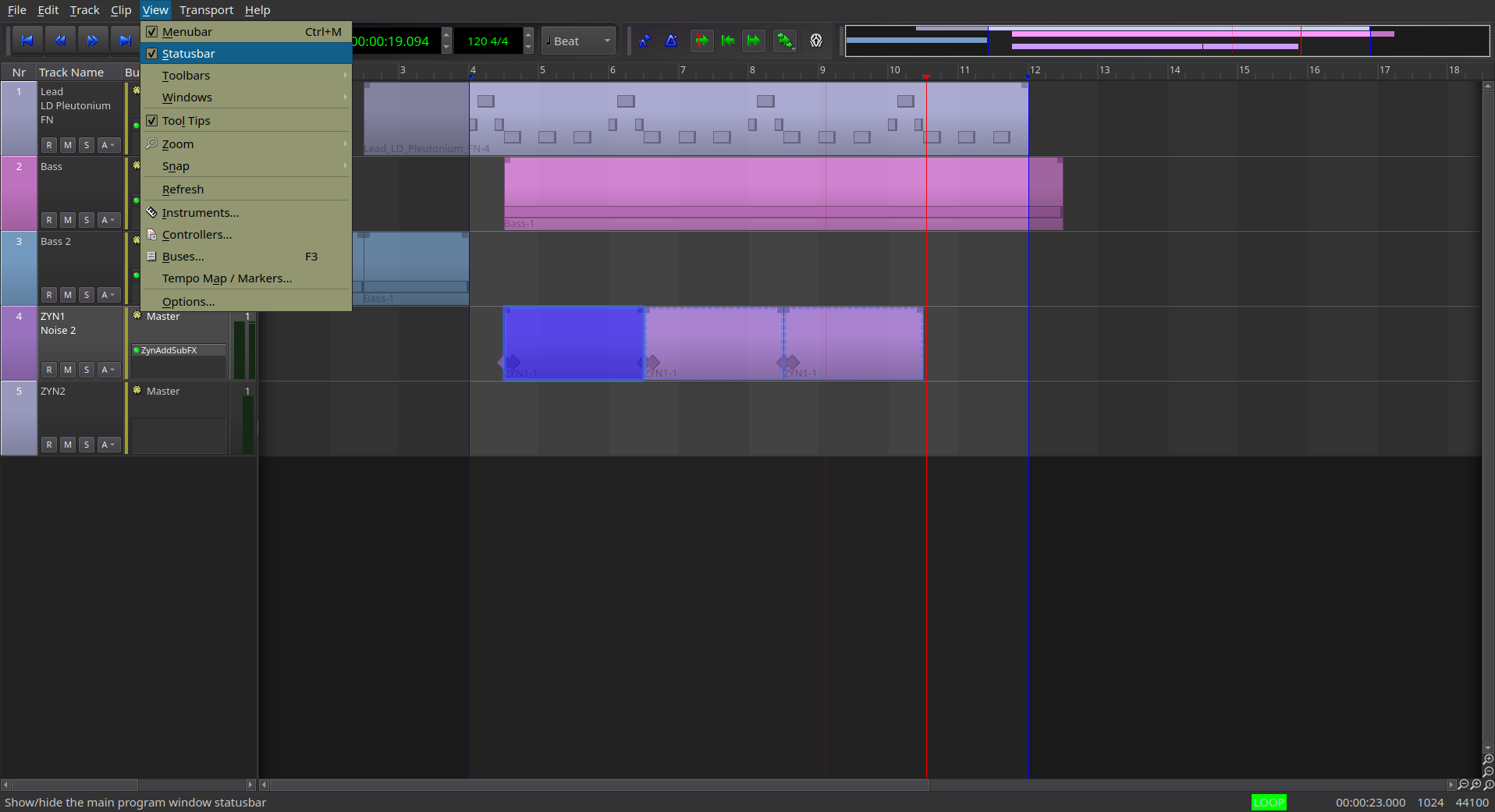
My tracks are still being rendered using the previously established colors (This session was created prior to importing and using the theme).
The blue used to highlight the menu selection doesn't seem to "fit".... kinda gives it a very "Microsoft Windows XP" feel? Maybe using one of the already used greys would work better?
The icons in the Options toolbar haven't taken on the new visual characteristics of those in the Transport buttons. Are there plans to get to a place where all icons characteristics and behaviors match?
The "Session Loop State" notice in the bottom right hand corner is still impossible to read given the white font against the bright green background. I know there's a "Session XRUN State" notification area to the right of it which suffers from the same problem;. although the background color is a bright yellow. Are there any plans to address these areas?
Recent comments
3 days 14 hours ago
3 days 14 hours ago
6 days 13 hours ago
1 week 5 days ago
1 week 5 days ago
2 weeks 16 hours ago
2 weeks 1 day ago
2 weeks 16 hours ago
2 weeks 1 day ago
2 weeks 1 day ago