Forums
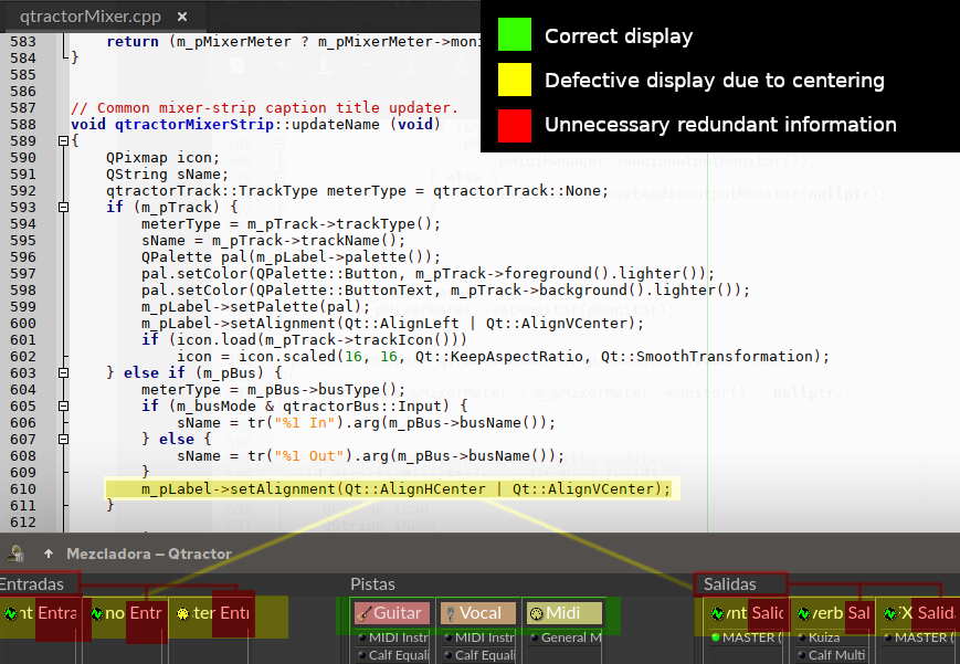
The title of the buses should be displayed centered on the right as in the tracks.
On the other hand, the input or output information is unnecessary, since it appears in the header of each group (Inputs, Tracks, Outputs).
re. UI MIXER (improvement suggestion)
done in develop branch: qtractor >= 0.9.36.7git.a49710
thanks
Thank you very much, My eyes
Thank you very much, My eyes rest at last
XD
New UI suggestion
Although the midi and clip tracks seem to be very different visually, and even the buses are different, sometimes when we have many tracks, especially if we start from a complex template, it is difficult to know at a glance which tracks are midi and which are audio. You have to make the effort to search. (yes, I know it's milliseconds of searching but it's noisy, tiring).
__
I propose this solution:
In the sequencer, the bus icon takes up the entire column, and the background follows the color code of its icon (green for audio, yellow for midi).
It no longer specifies in the title whether it is an audio or midi bus, the stripe is visibly noticeable, and the code green = audio, yellow = midi, clearly legible.
Likewise, a small strip with the color code is incorporated into the mixer below the track or bus title.
Furthermore, if we collect the bar on the right to show only the bus column, now the LEDs of the plugins are no longer visible, which was visually annoying (noisy).
Likewise, if we want to show the bulbs, it also appears more organized.
I think it gains in readability and cleanliness.
I leave it to your consideration.
I'd propose going even
I'd propose going even further:
Allow the end user to specify distinct colors used to represent Midi and Audio busses or just piggyback off what is already available under Preferences / Display / Meters. In other words, allow the user to escape from the hard-coded green/yellow used (although for the purpose of discussion, these examples will continue to use those colors).
Eliminate all of the midi and audio "icons" all together, both in the arranger window and mixer. The screen real estate would be better used to accommodate the text and the bus information can be communicated with color alone (as is being discussed).
In the arranger window, use only half of the proposed vertical space to convey the bus type (by color). Notice how the attached image makes use of already existing screen real-estate avoiding the need to push yet another column onto the end user. My quick gimp-made mock is just covering up the icon in order to show how color alone presents the information more clearly. As a result, it's still too wide. Ideally, the width would be consistent with the height used in the proposed mixer enhancement (posted above).
While we're talking about mixer UI improvements, perhaps adding the ability to hide by type? I'm pretty sure I rarely, if ever, need to see or interact with my midi tracks in the mixer.
I'd propose going even
_1
"Color is now available in Preferences/Display/Meters"
True, it's a great idea to take the color of those properties.
_2
I wouldn't remove the icons. The application uses them as a reference in many places. Are they also removed from the mixer? And about the configuration forms?
I think it would cause inconsistency to remove them.
So I propose to make the line thinner (5 px). This way, anyone who wants to see the icon can do so, and anyone who is in the way can hide it with the sequencer bar.
I also agree that the Audio and Midi text should disappear due to redundancy of information (visual/text).
_4
It is a functionality that would be very useful. For recording and arranging these tracks are essential. But for mixing it is preferable to render them to audio and work only with audio.
I have done it sometimes, and those muted midi tracks, (which should still be there in case an arrangement has to be redone), got in the way.
In the end Rui rules, but I find it enriching to raise these issues.
Right. I totally appreciate
Right. I totally appreciate your point of view on the icons as I didn't consider the input forms in the dialogs. For me, it'd be all or nothing as having them show up in this place but not that place would be confusing. As for the Bus column though, don't overlook the value of the text itself. For example, I personally tend to work with many buses since I usually host my synths externally (in Carla). For example, let's say I've got 3 MIDI tracks each being routed to a separate Noise Maker Synth, I'll create 3 MIDI buses named NM1, NM2, and NM3. In that scenario, the text (label) itself is actually more important for me than the color itself since I only ever work with MIDI.
Glad to see you understood my pitch to have the MIDI tracks added to a filter in the mixer so they could be easily hidden.
re. Right. I totally appreciate
By removing the text I meant only the words "Midi" and "Audio".
As for hiding, I have thought of a solution of "minimizing" instead of hiding. Many DAWs have a hide option, and I find it confusing, because when they disappear, it seems that they do not exist. Recovering them after visibility is also usually cumbersome.
Minimize/Restore seems more visually readable to me.
_S1/S2
In the sequencer, Minimize hides the R|M|S|A buttons.
When restoring the track it returns to the previous track height.
_M1/M2
Thanks to the fact that there would now be a color code, buses and tracks could be folded to a minimum, no longer being annoying if we do not use them at that moment.
For buses the Minimized color code would be Audio or Midi as appropriate.
For Tracks there would be two bands, the first with the color code of the track, the second the Audio or Midi type.
_M2
"Tooltip text" recover the name of the Bus or Track on Mixer.
Awesome ideas
Awesome ideas
re. New UI suggestion
hi,
the colored ribbon is now in develop branch (0.9.37.2git.44ca93)
not sure about the remaining suggestions, only that they're not a top priority atm. :/
regards
ps. here's a full-screenshot:
Thank you very much Rui
Thank you very much Rui, and honestly, I think it is useful.
It does not get muddy due to excess colors, plus the user can decide what color to put (in my case I am going to use very saturated tones for tracks and more pastel tones to identify Midi and Audio) so that the app does not turn into a psychedelic rainbow :).
I'm trying to understand how Qt works, in case I can help, make proposals with code and not burden you with work, or simply to customize Qtractor to my liking.
I come from web development and graphic design.
I was surprised that although Qt tries to separate the structure of the interface with XML from the "logical" code with the .ui... it does not manage to do so at all. And if I understood it correctly, it is more of a help that is later translated into C or Python code (depending on what you work with), than a true structure.
In web design everything is much more separated. The entire structure is accessible.
Form structure: Html (includes classes and IDs to be manipulated). There is no logical code or reference to shapes, sizes, colors (you can have them but it is not recommended).
Behavior: Javascript (full access to structure, with its classes and IDs)
Visual style: CSS (full access to structure, with its classes and IDs)
This makes everything much more versatile and cleaner.
The html reads clearly and you understand the entire structure of the elements.
The programming is totally separate. You access without having to touch the Html, the same with the visual CSS part.
Now I understand that any small change really becomes difficult for you.
Thanks again for everything :)
So cool
So cool
Add new comment