Main menu
You are here
Add new comment
I'd propose going even
I'd propose going even further:
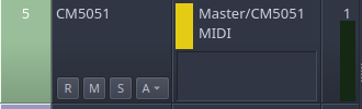
Allow the end user to specify distinct colors used to represent Midi and Audio busses or just piggyback off what is already available under Preferences / Display / Meters. In other words, allow the user to escape from the hard-coded green/yellow used (although for the purpose of discussion, these examples will continue to use those colors).
Eliminate all of the midi and audio "icons" all together, both in the arranger window and mixer. The screen real estate would be better used to accommodate the text and the bus information can be communicated with color alone (as is being discussed).
In the arranger window, use only half of the proposed vertical space to convey the bus type (by color). Notice how the attached image makes use of already existing screen real-estate avoiding the need to push yet another column onto the end user. My quick gimp-made mock is just covering up the icon in order to show how color alone presents the information more clearly. As a result, it's still too wide. Ideally, the width would be consistent with the height used in the proposed mixer enhancement (posted above).
While we're talking about mixer UI improvements, perhaps adding the ability to hide by type? I'm pretty sure I rarely, if ever, need to see or interact with my midi tracks in the mixer.
Recent comments
9 hours 7 min ago
18 hours 19 min ago
21 hours 51 min ago
1 week 4 days ago
1 week 4 days ago
2 weeks 15 hours ago
2 weeks 6 days ago
3 weeks 57 min ago
3 weeks 1 day ago
3 weeks 2 days ago