Main menu
You are here
Theming in Qtractor
18 November, 2023 - 14:34 — G3N-es
/ Edited: 17/01/2024 /
Topic for everything related to Qtractor theming.
Themes availables: https://sourceforge.net/projects/visualthemes-qtractor/
(Attach two starting approaches for two visual themes and a proposal for functionalities.)
| Attachment | Size |
|---|---|
| 252.26 KB | |
| 237 KB | |
| 44.92 KB |
Forums:
Thanks Rui. I'll have time to
Thanks Rui. I'll have time to test this tonight. Just to be clear, you're saying this should solve the "snap overshoot" behavior I've reported while preserving the shadow? I just want to be sure I know what I'm testing in order to provide accurate feedback.
re. snap overshoot behavior...
yes, probably
though I didn't quite understand why dropping the shadows it would ever affect the snapping behavior, but I trust your judgement ntl. ;)
cheers
Happy to report that this
Happy to report that this commit does fix the "snap overshoot" problem in the MIDI editor.
or does it? Of course, I had to be sure so I just compiled fresh from master and of course, I can not replicate the original issue :(
Was I the only one experiencing the problem of notes aggressively overshooting their snaps (to the right)?
Either way, I think I'm ready to stand with the non-shadow people just the same. I just don't like them (once you see it, you can't unsee... LOL). Even with the snapping issue resolved, I now see how when adding a note, it then "shrinks" (probably the 1 pixel thing) when the mouse click is released. It's just.... unnecessary and it gives the whole experience a bit of a weaker feel than it deserves. I remember testing the fix yesterday after compiling from the develop branch and for the first time, inputting a MIDI note actually felt like INPUTTING A DAMN MIDI NOTE! (lol). What I mean is, it just felt like the GUI was doing exactly what I was telling it to do as opposed to this morph-like re-render thing it does when shadows are involved. I do maintain I think it would be nice to offer an option even if it's just an added CONFIG parameter supported by cmake.
OK enough, I've beaten the note horse to death here :D
re. range colored strips on the time ruler headers...
somewhat done, already for looping and punching ranges; check it out on v0.9.39.6git.756cf5
enjoy
This...
This...
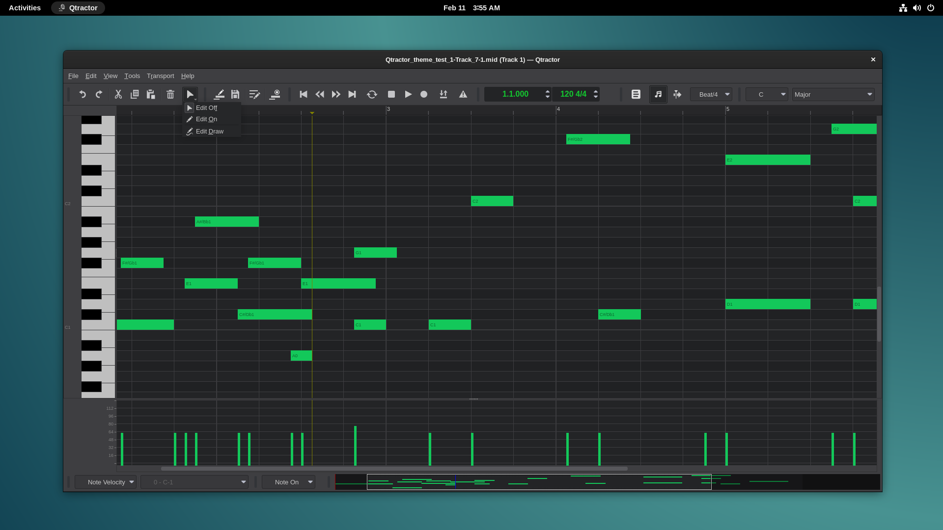
It's look like the MIDI Note is over bar 5.
Is it exactly on bar 5 or Is it overshot?
re. This...
it's the one-pixel-over-shadow effect!
:^)
We have a winner. This is
We have a winner. This is very nice. Extra bonus points as well since it is in sync with the state of the loop button!
Simple and great.
By the way, what's that
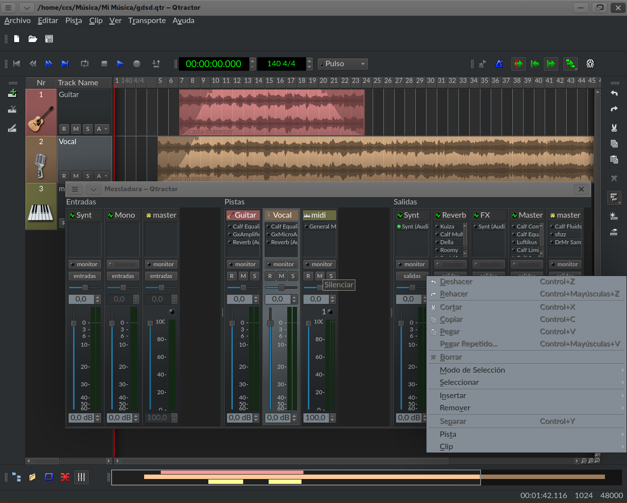
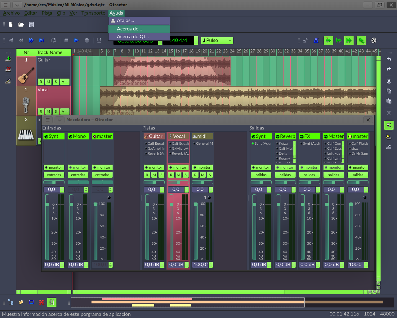
By the way, what's that purple line between the edit markers? I don't think I need it but it does look cool.
re. purple line...
it's the punch-in/out range; the other greenish line (actually it's transparent cyan, on a dark background) it's the looping range; in the picture both ranges overlap so their colors are merged, thus resulting in a violet colored effect.
byee
oh I understand. Yea, I don't
oh I understand. Yea, I don't punch. Makes perfect sense. Thanks.
re. qtractor Piano Roll (Midi Editor?) Mockup made with inkscape
Hello Kosai.
I take advantage of this thread to answer you.
First, let me tell that you are doing a very cool job.
The theme you are compiling looks very actual.
I liked the simplified scroll bars, and I implemented it in my Tecnico theme.
I just uploaded it.
https://sourceforge.net/projects/visualthemes-qtractor/
_ICONS
I see that you have taken advantage of some of the Iconduck "Monotone" icons that Windowsrefund selected.
I think it was necessary to create a complete pack (or several) of symbolic flat monochrome icons. I have it on my list for possible projects.
You mentioned how to change the Zoom buttons? Those buttons are part of the original Qtractor icon pack, so you already know the answer, redesigning them.
After reflecting on the issue of icons, I think it makes no sense to change the original Qtractor icons, because it is part of its identity.
It does make sense to create Icon Packs.
However, Qtractor is not able to handle it without compiling.
As I see it, implementing the icon pack management functionality is too complex.
All static paths written in code should be replaced with variable paths.
So the option that Rui told you about using the G3N-es-x branch has no place here, because it is not really necessary to program anything.
Just create icon packs and share them if we want.
Below I will explain about Branch G3N-es-x.
_BRANCH G3N-es-x
Rui did me the favor of creating that branch in case I wanted to contribute code, and so that he could review it to accept or not, without interfering with the official branch.
Others could use it for the same purpose.
The problem is that the branch broke with the updates.
I fixed it but I didn't notify Rui of the changes, because I realized that it was bothering him for things that only I was going to use.
The changes in that branch, apart from an issue of different icons, is that I have homogenized the midi editor buttons with those of the sequencer.
I haven't checked the latest update 0_9_39, so maybe even my branch is also broken now.
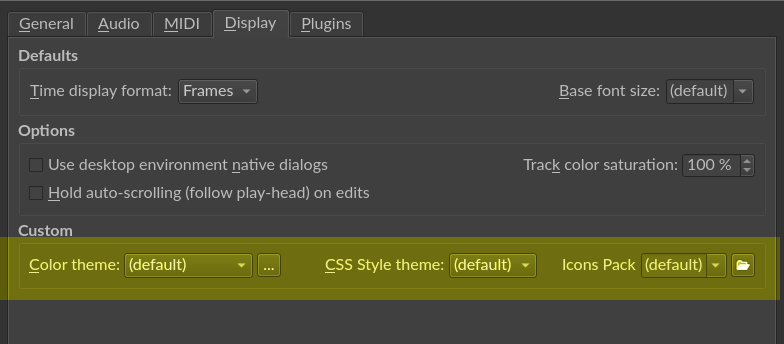
_Flat Style
I don't see it as crazy, and I think it is easily implementable to create a flat style option as Windowsrefund mentioned.
With it you activate:
- Gradients disappear
- Note embossing disappears in midi editor
- Track list only draws a dark border, leaving it flat (as you have done)
- Mixer strip only uses Dark color for borders, which also makes it flat.
I don't know about this last one as you all see it in general.
greetings
re. G3N-es
Hi G3N.😊
I'm glad my mockups inspired you to implement new scrollbar.
I adapted from you and WindowsRefund works. Thanks you all.
I'll draw a monochrome icon pack.
I don't want to bother Rui with requests.
I prefer flat style but I won't request him to make it flat just because of me.
He might be busy with works and family.
The beauty of Open Source Software is I can change the source code for my personal liking.
I just have to do it for every version update.
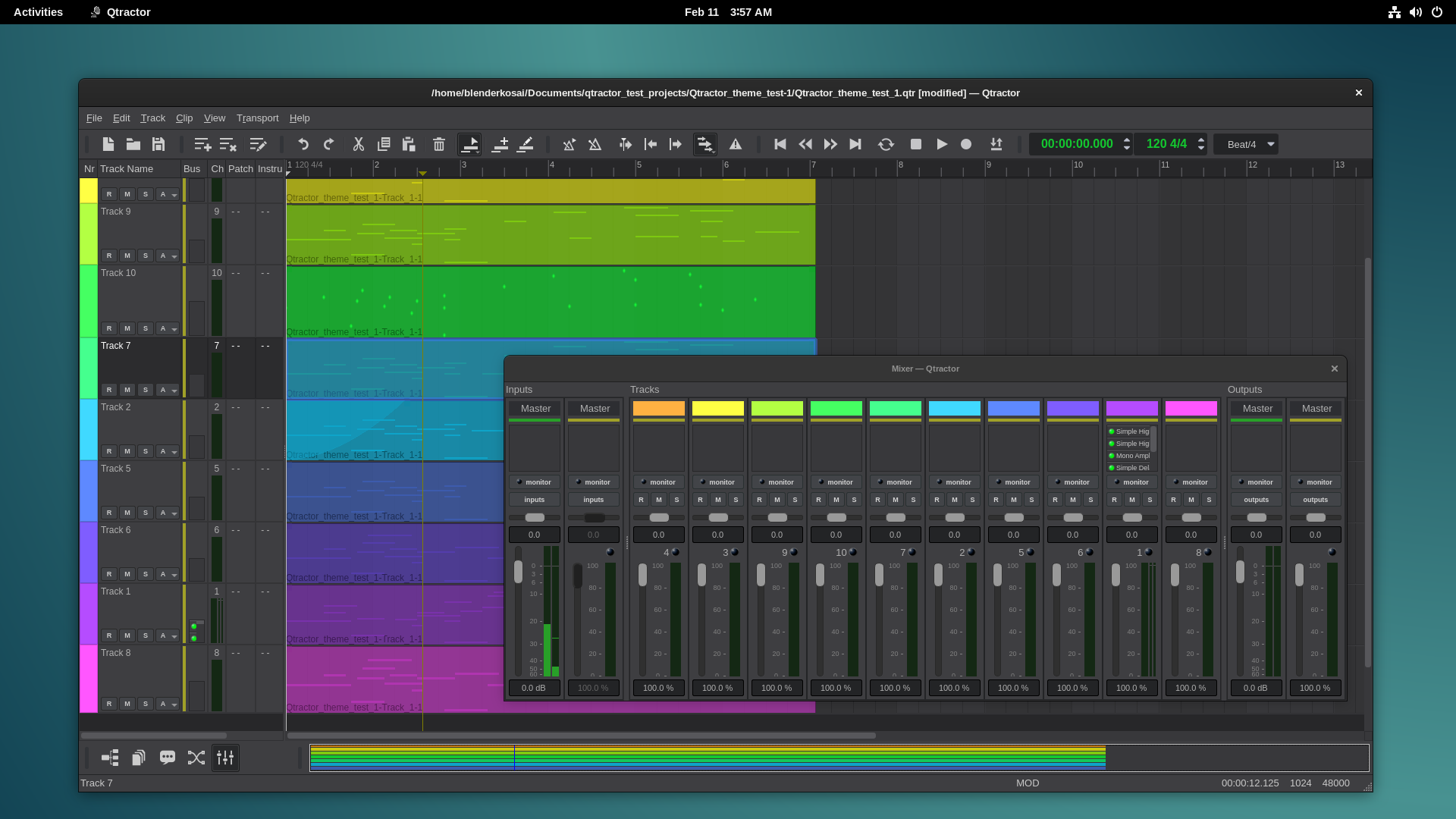
Nice theme you've got there. Tecnico Theme.
I'm sure EDM people will like it.
Have a nice day! See ya.
I think you're right
Basically the issue: Borders with reliefs, yes or no?, is a matter of fashion. They will return, I don't know when, but they will return.
As you say, each of us can make these small preferences in our compilation.
Gradients and relief in notes are personally indifferent to me. I like it both ways.
Like you and Windowsrefund, I noticed that small inaccuracy when positioning the notes, although I never gave it importance, because I trust the snap.
Rui just fixed it. He wants the reliefs in notes, it is his program and he must preserve its identity. And I'm glad he does.
But the sharp edges in the sequencer are going to be flattened in my next compilation. :)
The mixer can currently be flattened by choosing a dark color for the Light color.
re. matter of fashion
yes, fashion...
as some guy once said, way back from late 19th century, fashion is something so abstruse that it must change every other season. :)
cheers
It's great! I don't like the
It's great! I don't like the red dot used for recording (personally) but that's just cuz I'm an absolutist. Great work and very inspiring!
re. windowsRefund
It's ok. I was like...Let's thrown stuffs on it and let's see how is it look like. 😄
Big shoutout to the old
Big shoutout to the old Cakewalk. I actually started on version 3? (the one with the dots) and moved along into v5 and maybe last used it on v8. One of the things I quickly learned to really appreciate about Qtractor was the "cakewalk inspired" design which clearly treated MIDI as a first class citizen (as compared to the other wares which focused primarily on Audio).
I've never seen that lollipops offer anything functionality over bars but haven't given it any real thought. I guess anything vertical is fine by me compared to some of the more labor intensive methods I've seen other wares use.
Lollipops!
I think it's make it easier to click on it. Bars are like 2 px width.
Lollipops are a bit bigger so it's easier to click.
I'm not defending lollipops. I'm neither like it nor don't like it.
I'm ok with or without lollipops.
Actually, I just granted
Actually, I just granted myself a moment to really think about the merits of a lollipop over a fixed bar and i finally understand where the former wins every time. The obvious win would be in the improved visibility when notes overlap! Hmm... that only took me decades to understand. I get it now.
Drawing Mono icon pack
Compiled qtractor with monochrome icons (Work In Progress)
---------------------------------------------------------
Test run with new icons. Made with inkscape
Pixel Perfect icons. 😎
Tried replacing .png with svg. Didn't work.
I think SVGs icons can scale up with Monitor resolution
without loosing quality since SVG mean Scalable Vector Graphics.
But since I don't have 4K monitor so 22px png is also ok.
Looks good
I see that you are respecting the original visual concepts. Looks good :).
I think that to use icons with another name (another extension), you have to rename the names not only in qtractor.qrc, but within the code of any file that contains the name (it is the same problem of non-variable paths that I indicated on other occasions ).
Maybe with a search/replace: from "example.png" to "example.svg" with a text editor that allows you to do it in files (search in files) like Geany, Kate etc.
I don't know if it's worth the work.
I can think of another sloppy solution that I don't know if it will work. Rename the "png" as "svg". I don't know if QT will read the internal format of the file without taking into account the extension in its name. If so it should work.
re. Compiled qtractor with monochrome icons...
I guess,
for you to actually apply the SVG icons, you'll need to include them in the qtractor.qrc file in addition, and then change all the old .png references (by name) on the .cpp and .ui source files, wherever they are.
example: images/qtractorConnections.png have a sidekick images/qtractorConnections.svg; while the former is not used anymore, the later is the scalable version of it, and actually shown on the Connections window title.
hth. cheers
re Rui
Thanks you for helping me Rui. 😃
Last night, I did replace file name in 3 places.
- *.cpp
- qtractor.qrc
- .ui
Somehow, it only show up the objectName property.
I'll try again tonight.
I might be missing something else.
Cheers.
qtractor theming finished.
qtractor theming finished.
Well, almost ( I've to draw a few hidden icons )
Gotta go back to my normal job. Client want me to do some design work.
It's sad I couldn't even made a single music. 😒
re. qtractor theming finished...
hi, ok,
cheers && terribly hope to see you back soon!
I've found something
I've found something interesting in every one of your ideas. For example, the darker background on a checked icon... that's the complete opposite of what I've been doing with my theme and I'm really liking it. There's a good chance I'll steal that idea :D
As for the music, remember, it's not about any particular goal or task being completed. Rather, it's about the moments spent inspired. Inspiration can and does reveal itself in many fashions. The musical expression will happen when it happens.
Tecnico 2.2 with significant improvements
- Highlight color changes to orange.
- Integrated forms style.
- More integrated midi editor and larger note names.
https://sourceforge.net/projects/visualthemes-qtractor/files/
Very impressive!
Very impressive!
Hey G3N-es,
Hey G3N-es,
Any chance you know how to access that gray background of the selected output?
.re access that gray background of the selected output
qtractorPluginListView QMenu::icon:checked {
background: red;
}
Pages
Add new comment