Main menu
You are here
Theming in Qtractor
18 November, 2023 - 14:34 — G3N-es
/ Edited: 17/01/2024 /
Topic for everything related to Qtractor theming.
Themes availables: https://sourceforge.net/projects/visualthemes-qtractor/
(Attach two starting approaches for two visual themes and a proposal for functionalities.)
| Attachment | Size |
|---|---|
| 252.26 KB | |
| 237 KB | |
| 44.92 KB |
Forums:
Reaper is not free software
Reaper is not free software though.
On the topic of tinkering and customization, I'll just add my $0.02 that the real value of being able to do so is driven mostly by the desire to get as much of the tool out of the way so the artist can enjoy and generally get "closer" to the work being created. In other words, I do agree with much that's been said about how a given look can inspire but that stuff is short term. The real value of customization gets measured in the simple equation of "how much pain do I have to endure in order to explore a particular idea or inspiration?". That's a value proposition we see patterned over and over in all areas of computing. For example, a developer writing code wants to create an object quickly in order to start exploring a particular design. If it takes 10 minutes to write the scaffolding every time, that developer is going to be less motivated in the long run. That's why people make the investment up front beefing up their editors with super powers like LSP, snippets, and more.
Essentially, the end game is to get the tool out of the way as much as possible.
re. windowsrefund
Yep, REAPER is not free software but it's very customizable.
I think it's a one of many reasons people love reaper.
But I don't like reaper midi editor. I prefer qtractor midi editor over reaper.
Reaper midi editor is driving me nuts. 😅
This looks great. I really
This looks great. I really like those sliders too!
Thanks you :D
Thanks you :D
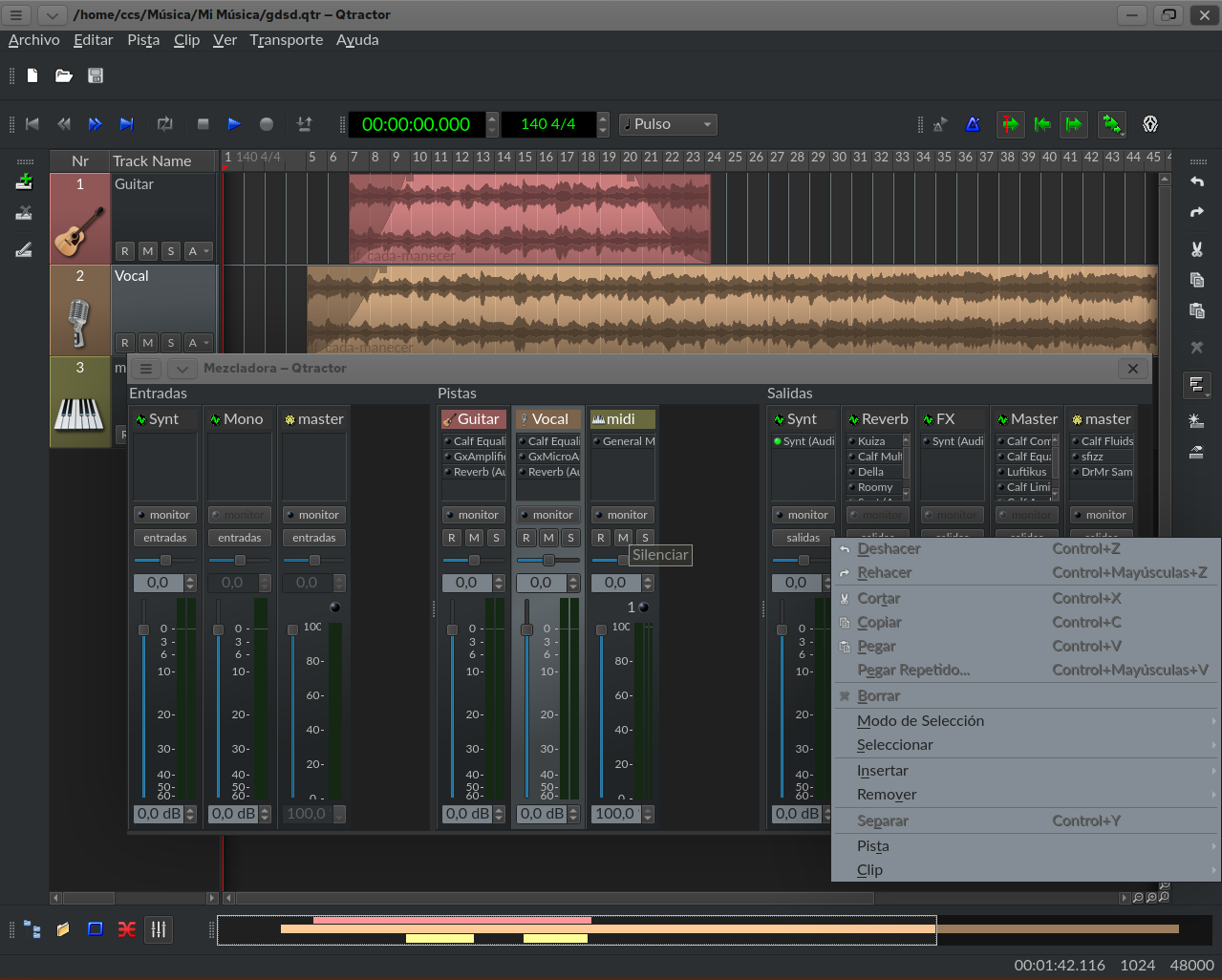
UI Mockup made with inkscape
I made some icons and UI Mockup with inkscape.
I don't like buttons design. Maybe I'll make new buttons designs later.
re. UI Mockup made with inkscape
Thanks for showing how the list of tracks looks like without border emboss. I like it.
It is one of the things that cannot be changed without touching code. :S
Trick:
If you create this little QSS
* {
background: green;
border: 1px solid white;
}
Everything that appears in green and white border is customizable.
If it is green and it should be another color (selected mixer track, front and background color in "track window"...) it is customizable, but you may lose some functionality by doing so.
Re. to G3N-es
Here is how it look without gradient shadow.
I compile it last night.
Re. to G3N-es
Here is another screenshot.
Bevel effect is made of two lines. Lighter line and darker line.
I made two line to use same color by editing C++ codes.
Two line is a bit thicker than I expected.
I also make the midi notes to look like without border.
It's actually same fg color and bg color. So it look like without border.
But I won't be able to see Note name because of it.
Re. to G3N-es
somehow ... my comments disappear. Maybe because of script tag
somehow ... my comments disappear. Maybe because of script tag
Re. to G3N-es
Wow....That's a really cool way to visualize. Thanks you. 😇
CMakeLists.txt | Code Line 181
option (CONFIG_GRADIENT "Enable gradient eye-candy (default=yes)" 1)I could disabled gradients by setting it to 0. And I compile qtractor.
It will effect Shadow of Sequencer Window, Midi Editor Shadow, Piano Roll, Track List ...so on.
Example Midi Note
But Uhm....
I would like to be able to theme other parts which is inside C++ files.
Mostly, the border (or shadow?) of MIDI notes and MIDI Note Name Font.
Currently, the Midi Notes have some kind of border (or shadow) around it.
It's kinda offset to the left (or x?) and bottom.
Right side is bigger than left size ( if we think of it like a border ).
Personally, I don't like it. I perfer solid rectangle or solid rect with border 1px, equal on all 4 sides.
And...Midi Note Names are still small even if I zoom in.
And I'd to be able theme the background of the Effects in Mixer as well as in TrackList.
I've been messing source code and make change here and there.
I could change some hardcoded color to use color palette.
But not everything I wish I could.
I could change the slider to more compact form tho.
I copied some QSS from stackoverflow.
So....I'm kinda....lost...
I've found some free time to
I've found some free time to start exploring some of the things we've been discussing and wanted you to know there's no need to actually change the contents of the file itself. You can set the option at compile time with the following
Wow....Thanks you. :-D
Wow....Thanks you. :-D
All due respect, it's
All due respect, it's starting to look like a boring and typical mac interface now. With all the talent on this thread, I think we can do better. :)
It's true. I copied Logic Pro
It's true. I copied Logic Pro UI. 😁
But to be honest...I kinda lost my interest because I can only do limited things using QSS.
A lot of UI related codes are inside C++ files which I do not want to change the code.
It's gonna mess up the source code.
I don't know QSS or CSS either. I'm just running away from my normal job and taking rest and...playing around with music softwares.
I read a little bit of Qt Documentation so I can play around with it.
I can make a few icons if you want me to.
LOL. Yea, I don't know
LOL. Yea, I don't know anything about design either and tend to just enjoy a minimalist approach. I ended up just using icons from iconduck since all that stuff is Free Software.
Compact Slider
This is compact slider. I copied some QSS from stackoverflow.
I still don't know how to add custom zoom in out icons.
I don't know what is that color bar do
I don't know what is that color bar do.
It would be nice if I could change the color or just remove it.
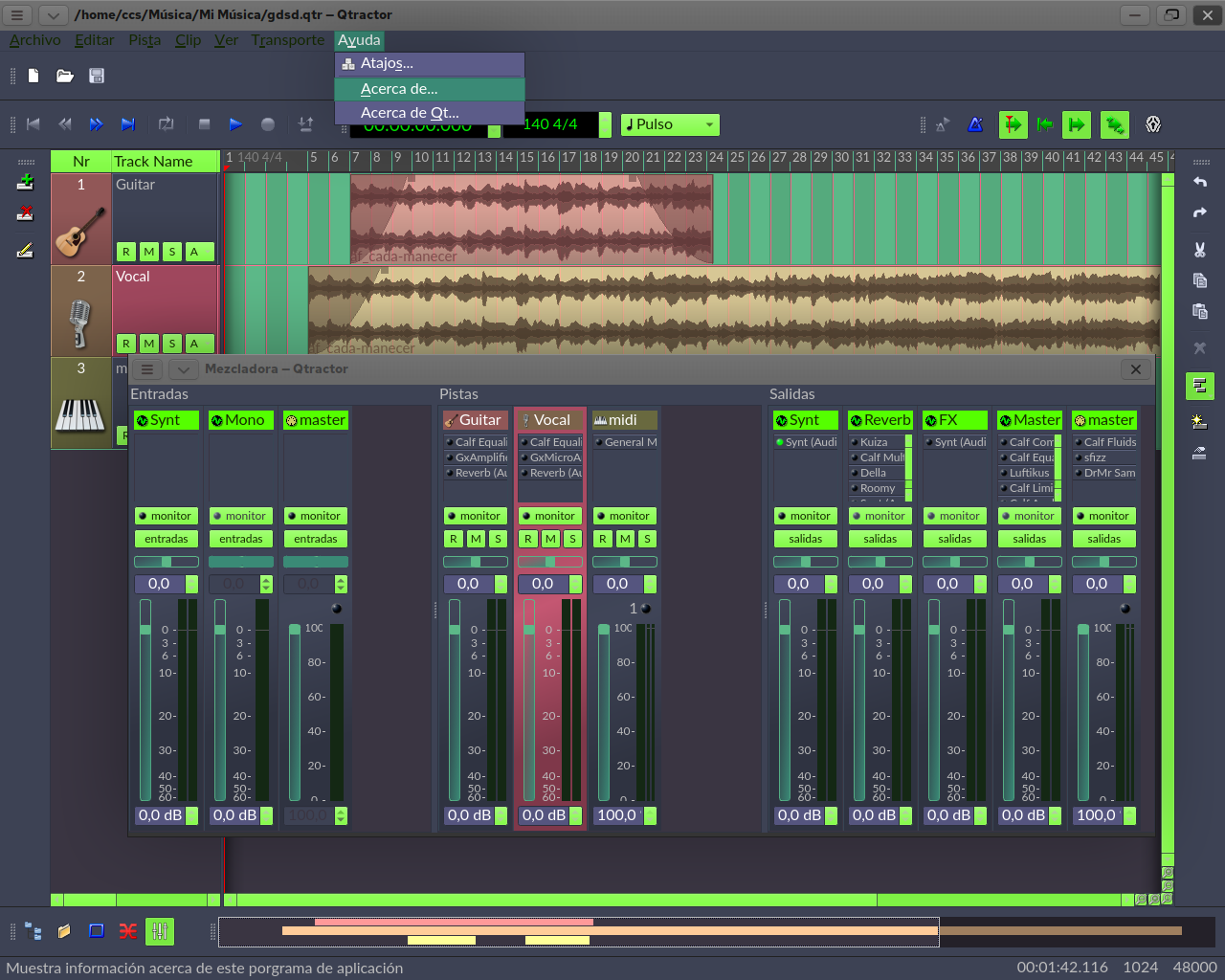
That's a quite recent
That's a quite recent cosmetic improvement actually. Essentially, it tells you what kind of bus it is (MIDI or Audio). Those colors are in sync with the color of the meters which are specified under View/Options/Display/Meters
Now I have to go compile with gradients disabled :D
uhhh...got it
uhhh...got it
Dark Theme Mockup made with inkscape
Quite nice!
Quite nice!
qtractor Piano Roll (Midi Editor?) Mockup made with inkscape
I designed a mockup for qtractor piano roll with inkscape.
I redrew every icons as svg.
There gotta be a way to make sliders look like in mockup.
I can do rounded slider but not zoom feature.
What do you think? Is it look good?
re. Piano Roll (Midi Editor?) Mockup made with inkscape...
@KOSAI: I think you and @G3N-es should talk, especially about the icons.... please take a chance on the branch named after his. AND apply for a QSS course ;)...
otoh. I'm no big fan of lollipops: bars are my thing, sorry :) besides, the slight shadow of the MIDI notes, which you make it plain boring flat, are originally intentional as being one of my beloved things back from good old Cakewalk Audio Pro Series, the actual inspiration to qtractor design, mind you:) yes, Logic was already there at the time, but gawd it was just flat-boring to the eyes, as still is, imnsho. XD
cheers
ps. but yay, there's a thing I like in your mockup: the range colored strip on the time ruler header, though orange-yellow is kind of a stretch :S
re. Rui
I don't know what do I talk to G3N. 😄
Icons....ahh...I made it on the fly while I'm doing mockup.
I've never done UI design work before qtractor tho. I'm just messing around like a kid.
It's pretty fun! 😃 So...uhmm...idk...
And the Git and branches things...I don't know about it either. 😁
Programmer stuffs.
Lollipops...I feels neutral on it. I neither like it nor don't like it. Bars are also good.
But that slight shadow on MIDI notes...Oh..god...It's really hard for me to snap notes to grid.
My brain is like...is it on the grid or...is it slightly off the grid...I can't decide.
I've to zoom in a lot just to make sure the note was snapped to the grid.
I understand you love MIDI Note Shadow. It's just me...having hard time. 😄
But flat note will help (at last me) to see it better. I should check my eyes.
I think my eyes have problems. Because I can't also use Dark Mode. Especially high contrast Dark mode.
I admire people who can use Dark Mode without problem.
I really like Dark Mode but my eyes are not ok with that.
And the MIDI Note Names...
I'm really suck at music. I can't even make chords.
So I really really need to see the name of the notes.
But the font...small....uhhh....
By the way, I'm not a Logic Pro fans or user or anything.
I watched a few videos about Music Theory a week ago...
So...No DAW in my life before. In fact, I hate Apple.
I'm glad you liked range color strip. Orange-Yellow is also not my best choise.
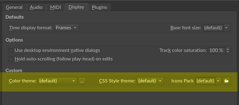
Color are hardcoded. Something like Qt:red. So I googled it. I found a few color I can replace. So I replaced it it.
I wish I could use HEX color but I don't know how to.
That is for now.
Have a nice day! 😊
Actually, I have most
Actually, I have most definitely noticed snapping MIDI data is problematic and would have mentioned something along the way but I honestly thought it was just me. In my experience, the note overshoots most of the time, crossing the intended snap (to the right) that I intend for it to land on. I have gotten quite accustomed to grabbing the right side and shrinking it back to what I had originally intended.
So there may be something here worth fine tuning?
BTW, I also have no knowledge of music theory so for years now, I've relied on the actual MIDI note number rather than the musical name :)
I didn't notice the colored loop range but agree it's a great idea. As for the color, it should obviously match whatever color is used for the loop markers themselves (vertical bars I mean). In other words, it would make no sense to make a horizontal range indicator color configurable if the corresponding vertical markers had their color fixed.
re. windowsrefund
https://github.com/rncbc/qtractor/blob/main/src/qtractorMidiEditView.cpp
Line number 664
I changed that to
Notes will lose shadow but snapping is good now ( at least for me ).
Try changing it. Compile and test it.
Uhm...... this is AMAZING! It
Uhm...... this is AMAZING! It is an absolute game changer in terms of accuracy when it comes to the snapping behavior of MIDI notes in PR. It's so distinctly different, I keep re-checking it over as my mind has grown quite accustomed to the old behavior over the years. Just for giggles, I commented out line 659 as well and recompiled. Although the diamonds never appeared to "suffer" from the same snapping issues as notes, I was curious to just see what I'd see. I did not notice any cosmetic or functional difference. That said, I would be very curious to know what your experience would be if you wanted to give it a go?
Line 659
Anyway, as far as the notes are concerned, I will never go back to shadows. I have SEEN THE LIGHT! :D
Rui, this is amazing and so worthy of a boolean option configurable by the end user.
I'm glad it helps you.
I'm glad it helps you.
I think the logic behind snapping code is fine.
Maybe it's just the brain is trying to perceive Shadow is not a part of MIDI Note.
So we overshot MIDI note to the right side.
Diamond Notes are fine. With or without Shadow.
Visual different is just 1px on the x axis(left, right) if you selected Diamond Note.
Without shadow, there is no 1px different.
But take my words with a grain of salt. I checked the different for about 2 minutes. I had to go out so...
re. accuracy when it comes to the snapping...
is that about a one-f*-pixel offset that was showing on the blue-shaded floating event selection?
that's just one lousy excuse to drop (my beloved) shadows... go fetch the fix in 0.9.39.5git.27210b [develop], please.
or else, you may choose apostasy, but shadows are to stay put and may never ever leave the main branch.
not in my watch >:)
cheers
Pages
Add new comment